
Problem
National Service website was designed to enable volunteers, AmeriCorps, Senior Corps members to connect and provide service for the greater good. We have observed that the website isn’t meeting the needs of its users due to the crowded layout and absences of a direct direction. Leaving our users feeling overwhelmed and frustrated that they aren’t able to complete the tasks they need.
Solution
How might we create a less crowded, more straight forward navigation system for the National Service website that will allow our users to complete their tasks without feeling overloaded with the disorganization of the site.
My Client Sadie Porter struggles to stay on budget during travel especially during peak holiday seasons such as, Christmas because they always face unexpected household expenses and their set aside travel budget takes a hit as she is unable to track and organize when booking online. She is in search of an App that will help her book a flight and maintain budget all in one place. She is introduced to TravelBuddy by her husband and Sadie wants to try it out.
Tools
Adobe Photoshop
Google Docs
Google Slides
Google Forms
Slack
Otter
Zoom
Project Overview
Strategy
Users on an average dedicate 15 seconds or less for a website. Come to think of it, it’s really not a lot!
It is very important for a Government Agency website to provide information that is easy to find and hold the user to complete the tasks intended within a short span. The main goals of CNCS is committing to improving lives, strengthening communities, and fostering civic engagement through service and volunteering. We as a team conducted heuristic evaluations tests to help us understand why the website failed in users completing simple tasks such as joining AmeriCorps, Donate financially and through service and learn more about Senior Corps which will help meet their goals.
Let’s take the case of Johnny Lockhart our user persona. He wants to do a service year. He wants to serve as an AmeriCorps member with ‘College Forward’ to help underserved students achieve their post secondary educational goals. We are committed to redesigning the website to assist Johnny in meeting his goal.
Tools
User Interviews
Iterations #1
Affinity Diagrams
Empathy Map
Google Slide Deck
Usability Testing
Iterations #2
Wireframing
Prototyping
Final Testing
Photoshop
Figma
Miroboard
Whimsical
Google slides
Google Docs
Spreadsheet
InVision
Zoom
Otter
My Role
Journey of Johnny Lockhart
Understanding Original CNCS Website
The main objective of CNCS is to help users learn how to apply for AmeriCorps, Donate and learn about Senior Corps. Did they succeed in accomplishing these tasks with easy navigation? Let’s find out.


.png)
.png)
Affinity Map
User Interviews Iteration
-
Donation button not visible
-
Too much text becomes hard to read and focus
-
Videos did not have subtitles
-
Font size too small in some pages
-
Pictures too large and cluttered
-
Too many links to click
.png)
Takeaways
-
Donation button to be added to the global navigation menu
-
Font size and contrast in the navigation menu bar
-
Link videos to YouTube directly
-
Add login in or my portal icon to the footer
-
Maintain font hierarchy
-
Keep Americorps application form simple and clear
-
Use slider for hero image
User Persona
.png)
Website Redesign Flow Chart

Iterations
Flow chart was challenging as we had several pages to create task flows. But based on our user scenario we decided to complete the tasks for all the 5 pages we chose to redesign.
Initially planned to have Grants and Funding task flow as this chart show. Later we swapped it with About Us page and included grants and funding information in serve your community page.
.png)
Final Card Sorting Process
This is the final Sitemap deliberate. We grouped the Navigation menu into Global, Primary, Secondary, Tertiary and Footer Navigation menus. We are created buttons on the top level for quick access.
Card Sorting
Sketches to Mid-Fi Wireframes with Iterations


Prototype
Takeaways
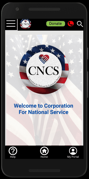
Primarily, we created and improved upon submitting donations, this was a straightforward enough task, and didn’t require much work to improve. Now, anybody visiting the site on mobile needs to have a way to learn about AmeriCorps and Senior Corps, and have an easily identifiable means of applying for these programs. To navigate between these separations, we implemented a navigation drawer, went through major and minor tweaks to the drawer, and eventually settled on a dark blue menu, centered on the current page. Within AmeriCorps and Senior Corps, we decided on a ‘show/hide’ toggle to learn more about the specifics that will help somebody visiting the site to gain a better understanding on what these programs seek to achieve. In hindsight, our mobile design iterations could have had a more substantiated focus on concentrating expositional text and images, and to keep in mind, passively, that our entire layout for mobile is the footprint for how the site manifests on other platforms, and to make sure that we don’t under-state the importance of the entire project by neglecting this understanding.
Mobile
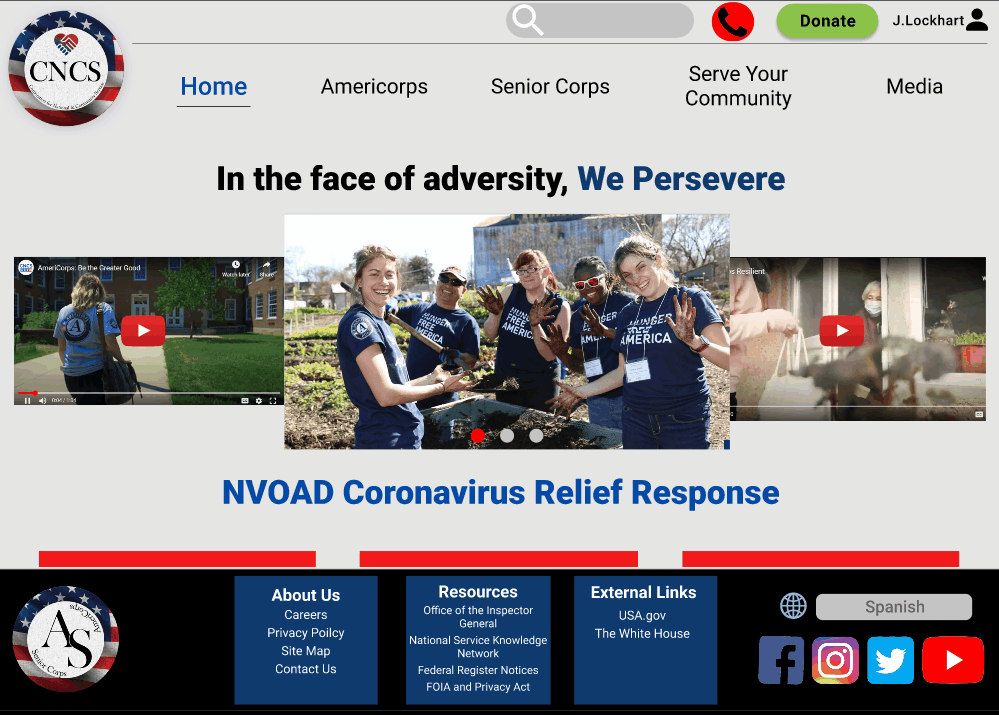
Desktop
Takeaways
Our initial design ideas was to simplify the navigation system by eliminating and sorting out the crowded content. The lack of focus and contrast made it difficult to complete tasks. So as a team came up with a button concept to separate the tabs and added drop down menu to keep things more clean and unified. But soon we came to find out that our box button menu was clashing with the background. So we regrouped and redesigned a simplified navigation bar and opaque box drop down menu. Overall, we had some challenges with the hierarchy and font size. In future we will start with the mobile, be more mindful of the font size, and not restrict ourselves with the choice of colors we choose early on. Through this project we learned about how to design for RWD desktop and Mobile interfaces. Looking forward to applying our new skills and tools to future projects.
